

Case Study 3: Curiousity Woodworks
Brand Identity Visual Design Assistance
What’s better than a craftsman? A CRAFTSWOMAN.
I met Erin Bell a few years ago when she helped bartend at my brother in-law’s restaurant in southern Vermont, Trail Break Taps + Tacos. Erin started Curiousity Woodworks with a headstrong goal of creating and building sustainably sourced furniture, cabinetry, tables and other wooden items (commercial spaces especially!!). She was involved with the production of many if not all of the dining tables at Trail Break. The design process doesn’t just start with the wood making materials, by popular demand each client will have their own idea of what they want. CW will build it using drafting processes with hand drawn elements that are also digitized for easy previewing abilities.
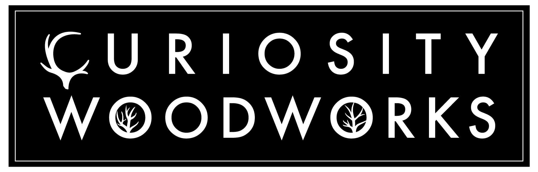
The logo concepts are derived from using the antler-emphasized ‘C’ shape as the leading mark for the brand. The ‘C’ works really well as its own component. We were able to also adapt the ‘O’ graphics from the previous logo, allowing for the vowels in “Woodworks” to have such strong representation of symmetrical tree branches. Afterword with Erin’s direction, I was able to pull together a cool color palette of soft greens and blues that can be used to represent CW.
